
You might be thinking that color theory is something artists and marketing folks ponder about, but not pregnancy centers. And, well, you're absolutely right.
When Rod Tackett, RETA's Advancement Director came on board last July, he wanted to bring unity to RETA's programs, materials, naming systems and colors. So you can blame him for adding pregnancy centers to the list of places that ponder color theory.
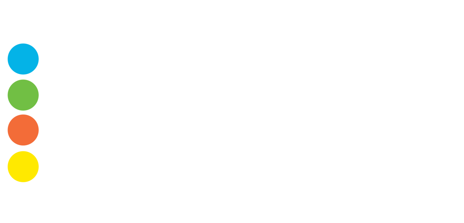
Here's Rod's explanation on RETA's colors and what they mean.
Blue is the color that invokes trust and is used by most local hospitals. Naturally, blue had to go with RETA's Medical Services - pregnancy testing and ultrasound.
Green is the color of renewal and new life. We tied this color with our Pregnancy Loss Support program as a reminder for those who have lost a child through abortion or through miscarriage, stillbirth or premature infant loss, there is hope, support and new life just around the corner.
Orange is the color of fun. (Just look at Nickelodean.) It best represents kids, so naturally we tied this color to our Parent Coaching and Resources.
Finally, yellow is the color of caution. Look out for the icy bridge, pedestrians crossing or that church around the corner. This very easily tied to our Healthy Sexual Boundaries Education, helping students make the positive choice of abstinence before marriage by creating and holding to boundaries.